Tuesday, 27 April 2021

Certified UI Designer


Dog walking app (mid fidelity) submitted last week, now assessed.

UI certified. Thanks RMIT


"The earner of this credential have a comprehensive understanding of the latest tools, techniques and best practice in UI design and experience. They are able to critically assess different UI methodologies, design and iterate an app interface and use a range of design methodologies and software tools to produce and test their own prototype from the ground up. User Interface Design is developed in partnership with Symplicit."

Wednesday, 21 April 2021

User Testing / Dog walking app

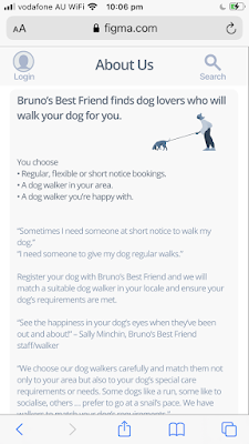
Bruno’s Best Friend Prototype by Kirrily Schell


... makes me want to be a walker. I like the cream tones with the grey text. It's gentle and friendly”


Link to Figma file - Low/Mid Fidelity 


Task for User Test: Find a walker and pay in person


Key insights: I think you should make your calendar page the go forward page.

  1. User wanted to swipe to view walkers – [I just didn’t get to this in Figma] – next iteration as it is key to the specific Userflow.
  2. User went to Booking page before filling in required details [ iterated several times around these choose walker/booking pages.] *Resolved / iterated - Booking now takes you straight to the form. Needs another iteration and test to see how it goes.
  3. User pressed the words “add to calendar, not the icon” on the Payment Success page 4. User wanted to make a booking straight away throught the Calnder icon in the bottom nav bar


General insights:

  1. Calendar at bottom would be pre-planned bookings and add to calendar (some confusion /needs rethink)
  2. I don’t know if “Bruno’s Best Friend is an app or am I trying to find a friend?”
  3. User clicks on text. Eg: Check my bookings
  4. Can you add services? Or is it just dog walking?


Resolve:

Regarding Userflow, the Calendar can function as the booking page. This is the main UI I need to focus on for this iteration. 
  • The function of the Calendar link. 
My plan was to have it available as a check your bookings and change your bookings - but for many it would be the go to initially as the make a booking. So I need to iterate my userflow.


In general the app needs more iterations


Monday, 19 April 2021

Prototype / mid fidelity

Need to go through and align much of the content. 


I’ll repost when finished. 

This is just looking at file on my phone - not to Figma Mirror  (so, not actual alignment)

Almost ready for first round of user tests. Really a low fidelity...

But as the visual design is apparent I’m calling it mid  


Lots of place holder things in here also  Just remaining in scope of project and getting on board all of the joy Figma has to offer  

And yes I need to move things around. I’m excited by this part. Can see myself becoming mega efficient with my components.


Tuesday, 13 April 2021

Gestalt Principles

 Gestalt Principles


UI Inspiration / Libby - Overdrive

I love this UI

Libby (new app released by Overdrive) access to digital library resources. Once signed in with your local library card links to e-reading resources "over 60000 anywhere in the world"

ebooks and audiobooks

These are screenshots from my phone.

It is beautiful


Making time to be creative / Too many ideas vs focus


I have to remember that it is okay in the process to relax into exploring ideas without being bound by what things should be.

#ideation

I'm inspired and really need to use that time piece thingy that Hermione Granger uses.

Too many ideas vs focus

Saturday, 10 April 2021

Figma Resources / Build it in Figma - Create a Design System / Tutorials x 5

 Build it in Figma - Create a Design System

Build it in Figma / tutorial / part II 

Big thanks to Rogie 

Build it in Figma link to Figma file with great resource links! 

Links are also pasted below


For reference - know it doesn't look cool - but quick access to resources is my aim!


Type Scale


https://type-scale.com/

https://spencermortensen.com/articles/typographic-scale/

https://alistapart.com/article/more-meaningful-typography/

https://practicaltypography.com/

https://practicaltypography.com/typography-in-ten-minutes.html

https://betterwebtype.com/articles/2018/10/15/rhythm-in-web-typography/


Color Palette Plugins


https://www.figma.com/community/plugin/740832935938649295/Color-Palettes

https://www.figma.com/community/plugin/797696673804519719/Color-Kit

https://www.figma.com/community/plugin/739475857305927370/Color-Designer

https://www.figma.com/community/plugin/742549221432366731/Palette


Accessibility Plugins

https://www.figma.com/community/plugin/734693888346260052/Able-%E2%80%93-Friction-free-accessibility

https://www.figma.com/community/plugin/732603254453395948/Stark

https://www.figma.com/community/plugin/748533339900865323/Contrast

https://www.figma.com/community/plugin/733343906244951586/Color-Blind

https://www.figma.com/community/plugin/733159460536249875/A11y---Color-Contrast-Checker


Grids & Spacers

https://material.io/design/layout/responsive-layout-grid.html#columns-gutters-and-margins

https://material.io/design/layout/responsive-layout-grid.html#breakpoints


Shared Styles


https://betterwebtype.com/articles/2018/10/15/rhythm-in-web-typography/


———————————


EPISODE 2: COMPONENTS


Material Design Responsive Layout Grids:

https://material.io/design/layout/responsive-layout-grid.html#grid-customization


Icon Grids:

https://www.youtube.com/watch?v=S9P7ob7Nx5I

https://www.figma.com/community/file/868494350497530898


———————————


EPISODE 3: COMPONENTS CONTINUED


Created:

Tooltip component

Media component

Card component

Textfield component

Toggle component

Checkbox component


———————————


EPISODE 4: TESTING YOUR COMPONENTS


Created:

Dialog

Image sizes

Popover component

Menu items


Links:

Material Theming Design System: https://www.figma.com/community/file/809865700885504168

Primer Web Design System: https://www.figma.com/community/file/854767373644076713

iOS 14/iPadOS 14 UI Kit: https://www.figma.com/community/file/858143367356468985


Contrast Plugin: https://www.figma.com/community/plugin/748533339900865323/Contrast


Change Text Plugin: https://www.figma.com/community/plugin/735148445325474400/Change-Text


Content Reel Plugin: https://www.figma.com/community/plugin/731627216655469013/Content-Reel


Data Populator Plugin: https://www.figma.com/community/plugin/787488293482536319/Data-Populator


Faker Plugin: https://www.figma.com/community/plugin/833836762121994814/Faker


Similayer Plugin (for selecting multiple similar layers): https://www.figma.com/community/plugin/735733267883397781/Similayer


———————————


Notes:

Maintaining aspect ratio in fluid width components: https://medium.com/@vitalii.solokub/figma-components-with-a-fixed-aspect-ratio-elements-c7272e2ada9

Monday, 5 April 2021

Userflow / onboarding / Figma

Mood board


Mood board


Initial mock up of what app may look like


Initial Taskflow / one persona


Userflow / two personas / Figma


Design library / working / Figma


Friday, 2 April 2021

User flow sans states / stack


Caters to two kinds of User personas

Rewarded myself with two kinds of Easter Eggs


and a song by Ryan Downey