
Spotify Artist feature app
UX Research
Useful Link for User Persona templates by Manal Mirza

UX / UI / Service Designer
Experience - Quick Look
Education
Education | UI Design | 2021 | RMIT Online
Education | UX / UI Design - Transform | 2021 | Academy Xi
Education | Cert IV Workplace Training and Assessment | 2004 | RMIT
Education | Masters in Animation and Interactive Media | 2004 | RMIT
Education | BA Fine Arts with Honours | 1997 | ANU - |Canberra School of Art and Design |
Experience
Experience | Small business: education/animation/illustration |2004- |Freelance
Experience | Lecturer / Design for Interactive Media |2006-12 |RMIT
Experience | Lecturer / Screen Production – Degree course |2006-12 |Holmesglen
Experience | Lecturer / Imaging |2005-8 |RMIT
Experience | Lecturer / Advanced Animation / Major Project |2006-8 |RMIT
Experience | Lecturer / 2D Animation |2007-08 |Vic University
UX UI design: MIRO, Figma, Adobe XD, Adobe Photoshop
Experience | research / interviews / personas/ userflows / wireframes/ interaction designs/ User tests / iteration/ UI design |2020 - 21 |Academy Xi
Experience | Userflows/wireframes/interaction design/ GELs |2020 - 21 | RMIT Online
Adobe Photoshop, After Effects, Flash
Experience | interaction design/animated interactives |2003-12 RMIT
Experience | Freelance – ongoing work with Adobe CS |2003->
Experience quicklook
1. UX / UI /Service design skills
I have UX and UI experience conducting contextual enquiries, userflows, user journeys, personas and utilising other UX design tools and methodologies for the following projects: a Spotify prototype, a service design for a healthcare provider, a strategy design for a not-for-profit organisation, and a UI design prototype for a dog walking app.
2. UX capabilities including UI wire framing, UX mock-ups, design mock-ups, story boarding.
My recent UX UI course at Academy Xi gave me new/contemporary /best practice UX problem solving techniques, frameworks and methodologies. I’ve been a comics artist my whole life, and an animator for the last 17 years, thus storyboarding is something I love and I find it to be a useful way to explore a User journey and User experience. I find storyboards a great way to communicate a User journey to stakeholders.
I use MIRO, Figma and Adobe XD to work on mock-ups and prototypes, have always been a paper/pen/sketchbook user, so I do a lot of thinking and designing on paper; writing, and drawing wireframes in my sketch book throughout the design process to map out or explore ideas.
3. Ability to confidently communicate, both visually and verbally.
Working professionally for several years as a lecturer at two Universities, RMIT and Victoria University, and years of running other short courses and workshops (animation) has given me extensive experience with public speaking and allowed for me to refine my skills in this area.
4. UX Design experience
An example of my UX design experience with a healthcare process:
The client, "Health provider", offer an exercise program for osteoarthritic pain sufferers.
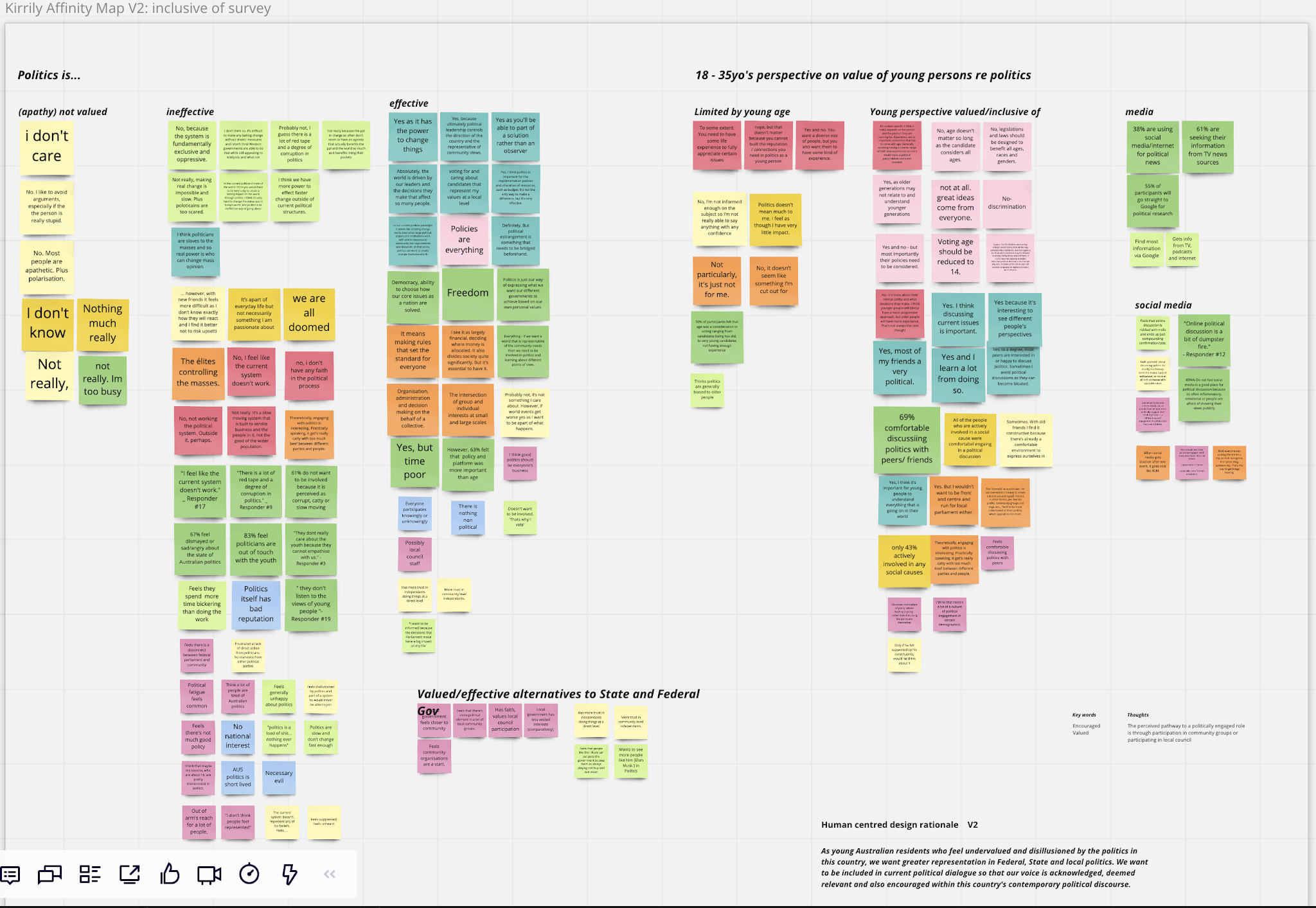
Working with a UX team my role covered research, ideation, design and included such tasks as survey and questionnaire writing and implementing, one to one interviewing, collating key findings, affinity mapping, storyboarding, user testing and presentation of the final solution to the client.
Our initial research identified the exercise program itself addressed user needs. We hypothesised the delivery of the service had problems. Our research identified multiple pain points for the program participants.
To identify the specifics of these problems my work involved survey and questionnaire writing and implementing, interviewing (looking at behavioural patterns, lifestyle, pain management experience, feelings), identifying and collating key findings, and using findings in Affinity Mapping.
Looking at the key findings my team; defined user needs, pain points. We created personas and ideated solutions appropriate to the program participants, current and future, who were for the most part over 60 and having to manage their pain.
5. Ability to engage with stakeholders
Much of my career has involved working across teams with interconnected needs; students, other lecturers, course coordinators and external guest lecturers (for example). Working in remote communities often involved working with a School or an art centre or a council – and more often all of those organisations together, with the student and communities’ needs as the priority or focus.
My UX design work involved working with my team, my UX mentor, a client/s, their product or service users and also at times other people who came into a contextual analysis study. I’m comfortable to communicate with stakeholders at all levels and anyone within the scope of the project or workspace.
6. A collaborative and confident working style and ability to work well in a dynamic fast-paced team
My work experience more recently has been in UX design, working in small teams. My example of the "Health provider" project was a 6 week project and the pace was fast. I’m confident and value working in a team. Previously as a sessional lecturer, often an independent role, I enjoyed being a part of the team working on the delivery and design of the courses taught. I worked together with my colleagues for students’ best interests. I’m equally happy working independently.
I use both Mac and PC - Love Mac …comfortable in Microsoft, quick and dedicated to learn anything needed for workplace projects.
Kirrily Schell
https://www.linkedin.com/in/kirrily-schell/

Here is a UX project example of my use of design methodolgies used to inspire a solution



I find storyboarding a very usedful document in regard to going through the User's experience
Gathering context, perspective of interaction, documentation or hypothesis of how the User is feeling or reacting to particular interaction with the product or design.
This example gives context and moves gives a user POV (point of view) of interaction with the product, in this case a mobile interface, and also that the User interacts with the product on Desktop also.
Storyboards are not just for communicating to stakeholders, they can give a UX designer varied perspectives of Userflow and interactivity with a product.
*Thinking about the role of the Storyboard in UX and also UI design

Dog walking app (mid fidelity) submitted last week, now assessed.
UI certified. Thanks RMIT
"The earner of this credential have a comprehensive understanding of the latest tools, techniques and best practice in UI design and experience. They are able to critically assess different UI methodologies, design and iterate an app interface and use a range of design methodologies and software tools to produce and test their own prototype from the ground up. User Interface Design is developed in partnership with Symplicit."
 |
Bruno’s Best Friend Prototype by Kirrily Schell |
“ ... makes me want to be a walker. I like the cream tones with the grey text. It's gentle and friendly”
Link to Figma file - Low/Mid Fidelity
Task for User Test: Find a walker and pay in person

I’ll repost when finished.
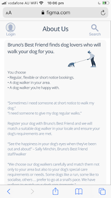
This is just looking at file on my phone - not to Figma Mirror (so, not actual alignment)
Almost ready for first round of user tests. Really a low fidelity...
But as the visual design is apparent I’m calling it mid
Lots of place holder things in here also Just remaining in scope of project and getting on board all of the joy Figma has to offer


 |

Libby (new app released by Overdrive) access to digital library resources. Once signed in with your local library card links to e-reading resources "over 60000 anywhere in the world"
ebooks and audiobooks
These are screenshots from my phone.
It is beautiful


I have to remember that it is okay in the process to relax into exploring ideas without being bound by what things should be.
#ideation
I'm inspired and really need to use that time piece thingy that Hermione Granger uses.
Too many ideas vs focus
Build it in Figma - Create a Design System
Build it in Figma link to Figma file with great resource links!
Links are also pasted below
For reference - know it doesn't look cool - but quick access to resources is my aim!
Type Scale
https://spencermortensen.com/articles/typographic-scale/
https://alistapart.com/article/more-meaningful-typography/
https://practicaltypography.com/
https://practicaltypography.com/typography-in-ten-minutes.html
https://betterwebtype.com/articles/2018/10/15/rhythm-in-web-typography/
Color Palette Plugins
https://www.figma.com/community/plugin/740832935938649295/Color-Palettes
https://www.figma.com/community/plugin/797696673804519719/Color-Kit
https://www.figma.com/community/plugin/739475857305927370/Color-Designer
https://www.figma.com/community/plugin/742549221432366731/Palette
Accessibility Plugins
https://www.figma.com/community/plugin/734693888346260052/Able-%E2%80%93-Friction-free-accessibility
https://www.figma.com/community/plugin/732603254453395948/Stark
https://www.figma.com/community/plugin/748533339900865323/Contrast
https://www.figma.com/community/plugin/733343906244951586/Color-Blind
https://www.figma.com/community/plugin/733159460536249875/A11y---Color-Contrast-Checker
Grids & Spacers
https://material.io/design/layout/responsive-layout-grid.html#columns-gutters-and-margins
https://material.io/design/layout/responsive-layout-grid.html#breakpoints
Shared Styles
https://betterwebtype.com/articles/2018/10/15/rhythm-in-web-typography/
———————————
EPISODE 2: COMPONENTS
Material Design Responsive Layout Grids:
https://material.io/design/layout/responsive-layout-grid.html#grid-customization
Icon Grids:
https://www.youtube.com/watch?v=S9P7ob7Nx5I
https://www.figma.com/community/file/868494350497530898
———————————
EPISODE 3: COMPONENTS CONTINUED
Created:
Tooltip component
Media component
Card component
Textfield component
Toggle component
Checkbox component
———————————
EPISODE 4: TESTING YOUR COMPONENTS
Created:
Dialog
Image sizes
Popover component
Menu items
Links:
Material Theming Design System: https://www.figma.com/community/file/809865700885504168
Primer Web Design System: https://www.figma.com/community/file/854767373644076713
iOS 14/iPadOS 14 UI Kit: https://www.figma.com/community/file/858143367356468985
Contrast Plugin: https://www.figma.com/community/plugin/748533339900865323/Contrast
Change Text Plugin: https://www.figma.com/community/plugin/735148445325474400/Change-Text
Content Reel Plugin: https://www.figma.com/community/plugin/731627216655469013/Content-Reel
Data Populator Plugin: https://www.figma.com/community/plugin/787488293482536319/Data-Populator
Faker Plugin: https://www.figma.com/community/plugin/833836762121994814/Faker
Similayer Plugin (for selecting multiple similar layers): https://www.figma.com/community/plugin/735733267883397781/Similayer
———————————
Notes:
Maintaining aspect ratio in fluid width components: https://medium.com/@vitalii.solokub/figma-components-with-a-fixed-aspect-ratio-elements-c7272e2ada9

